
Last Updated: January 20, 2026
Creating clone projects of popular applications is one of the best ways to master front-end development. Recently, I challenged myself to design and build three modern web app demos: Agoda, Amazon, and Swiggy. From the initial structure to interactive features and mobile-first responsiveness, each clone taught me unique lessons about web design and real-world coding standards. Here, I share my experience, the technologies used, and what you can learn by building your own clones from scratch.
Why Clone Famous Websites?
Imitating big platforms like Agoda, Amazon, and Swiggy might sound daunting at first, but it’s an incredible learning experience for anyone looking to:
- Improve HTML, CSS, JavaScript, and Bootstrap skills
- Understand UI/UX best practices
- Gain practical confidence with layout, forms, and interactive elements
- Build a standout portfolio that attracts recruiters and clients
In this post, I’ll walk you through my approach, key features, and the value of clone projects for both beginners and intermediate developers.
My Development Stack
To deliver visually accurate and responsive results, I focused on:
- HTML5: For robust semantic structure and accessibility.
- CSS3: Styling, custom animations, and layout precision.
- Bootstrap 5: For a fast, mobile-first grid system, ready-made UI components, and responsive utilities.
- JavaScript (ES6): Adding real interactivity, such as navigation bars, forms, and sliders.
Project 1: Agoda Clone – Replicating a Travel Booking Giant
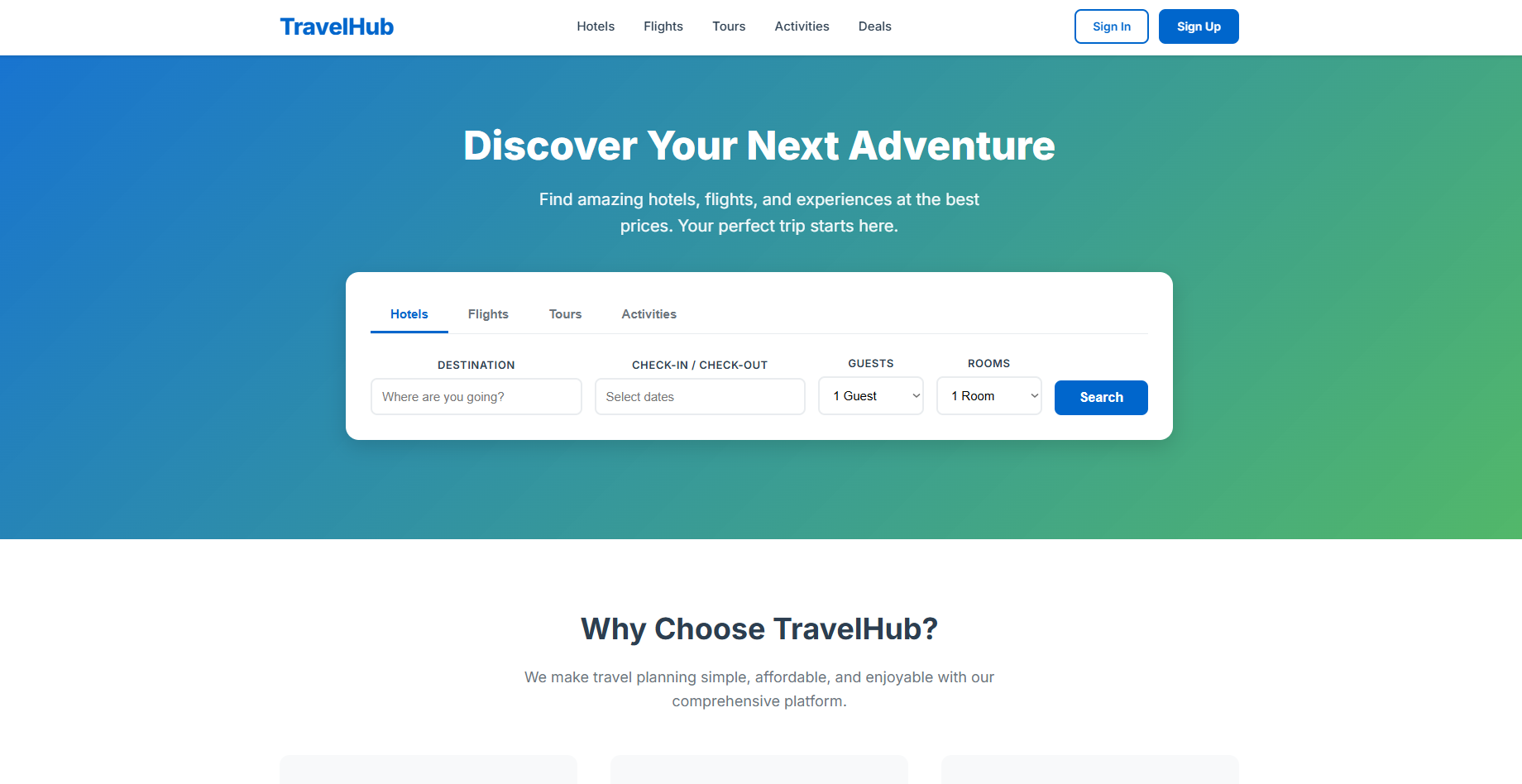
Layout & Key Features
- Header Bar: Includes logo, search fields, date pickers, and user account links.
- Advanced Search: Responsive forms allow filtering by destination, dates, guests, and more.
- Image Carousel: Showcases featured hotels and deals, utilizing Bootstrap’s carousel components.
- Accommodation Cards: Responsive grid layouts display hotel information, pricing, and CTAs (“Book Now” buttons).
- Sticky Filters: Sidebar or top filters adapt on smaller screens to a collapsible format.
Core Takeaways
- Mastered form validation using HTML5 and vanilla JavaScript.
- Practiced setting up realistic user journeys, from searching to booking confirmation.
- Learned to manage complex layouts with Bootstrap’s grid and flex utilities.
Project 2: Amazon Clone – E-commerce Made Simple
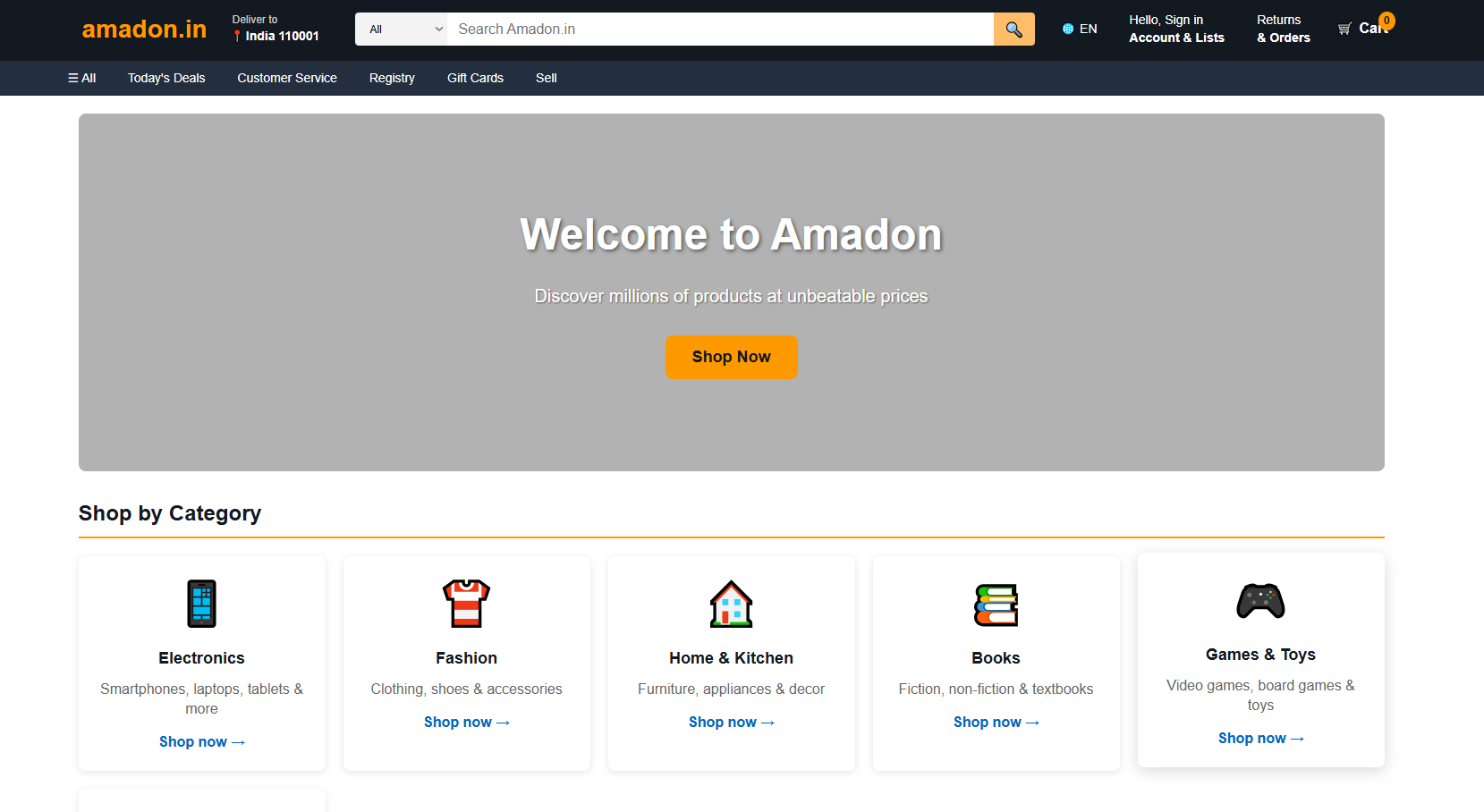
Layout & Key Features
- Navigation Bar: Integrated search, account profile, and cart system with live item count.
- Product Cards: Dynamic display of product images, ratings, price tags, and “Add to Cart” buttons.
- Category Menus: Side navigation for seamless browsing between electronics, books, fashion, and more.
- Checkout Flow: Simulated cart page, order summary, and address form—all fully responsive.
- Call-to-Action Banners: Attractive deal sections with promotional graphics and discounts.
Core Takeaways
- Applied Bootstrap for multi-tier navigation menus that adapt on smartphones and tablets.
- Used JavaScript to manage cart updates, form validation, and dynamic price calculation.
- Focused on accessibility, ensuring readable font contrast and keyboard navigation.
Project 3: Swiggy Clone – Online Food Ordering at Its Best
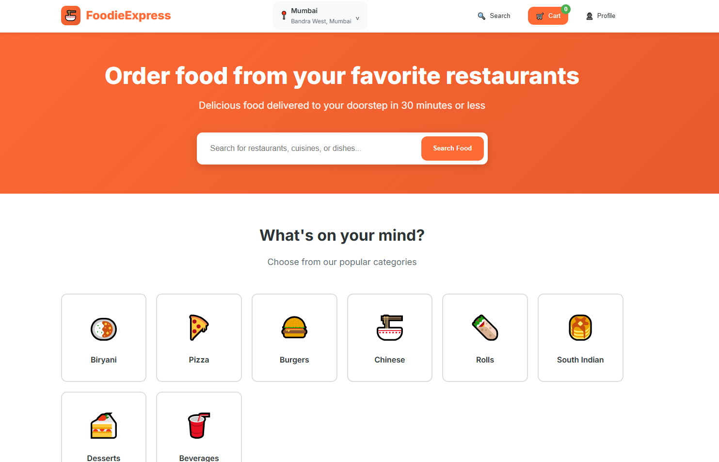
Layout & Key Features
- Top Banner: City/location selector, search for nearby restaurants, and profile section.
- Restaurant Cards: Listings display images, names, cuisines, ratings, delivery time, and cost information.
- Filter Panel: Real-time filters for sorting by cuisine, ratings, delivery times, and price range.
- Menu Page: Detailed restaurant menu with attractive dish images, interactive quantity selectors, and “Add to Cart.”
- Order Summary: Persistent order sidebar that updates live as items are added or removed.
- Checkout Demo: Simulated delivery address form and order completion screen.
Core Takeaways
- Utilized Bootstrap badges, alerts, and modals to create rich interactions for orders and updates.
- Implemented real-time form updates and item addition with JavaScript.
- Prioritized a smooth, frictionless user experience even on small screens.
Lessons Learned: Growth as a Developer
Building these three clones was more than just a code exercise—it shaped my approach to practical web development. Here are the biggest lessons:
1. Mobile-First is a Must
Each clone was built with mobile responsiveness from the ground up using Bootstrap’s grid system, ensuring every component, from navbars to forms, works beautifully on every device.
2. Component-Based Thinking
Breaking each app into reusable components—cards, carousels, menus, and forms—not only saves time but prepares you for modern frameworks like React or Angular.
3. Attention to Detail
Consistent spacing, colors, and interactivity matter as much as advanced features. Little touches like transition effects, box shadows, and alert messages build a polished, professional feel.
4. User Flow Matters
Anticipating the user journey, from landing page to checkout or booking confirmation, helps you architect a more seamless experience, even in static demos.
5. Accessibility and Usability
Thoughtfully chosen button sizes, proper semantic HTML tags, alt text for images, and keyboard navigation aren’t just best practice—they’re essential for reaching all users.