
Last Updated: January 15, 2026
Introduction
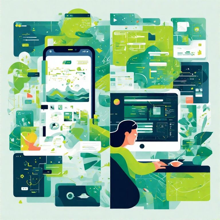
In today’s digital landscape, software designers face the challenge of creating user experiences across diverse platforms – primarily mobile apps and desktop software. Understanding their fundamental design differences is essential for UX/UI designers, product managers, and developers to deliver intuitive, effective interfaces. This post compares key design principles in a structured table and detailed explanations to strengthen your design strategy.
📊 Concise Comparison Table
| Principle | Mobile Apps | Desktop Software |
|---|---|---|
| Screen Size | Small, varied sizes; responsive UI essential. | Large, consistent sizes; more layout flexibility. |
| Navigation | Gesture-based (swipe, tap); bottom nav common. | Click-based with menus, toolbars, sidebars. |
| Input Method | Touch, virtual keyboards, voice input. | Keyboard, mouse, multi-window interactions. |
| User Context | On-the-go, quick tasks, shorter sessions. | Longer focused sessions, productivity-oriented. |
| Performance | Optimised for battery, memory, lightweight apps. | Can utilise higher CPU/RAM; heavier software possible. |
| Notifications | Push notifications for re-engagement. | System tray alerts or in-software notifications. |
| Updates | Frequent, seamless via app stores. | Less frequent; requires user installation or auto-update. |
| Design Language | Platform guidelines (Material, iOS Human Interface). | Desktop OS guidelines; more freedom for custom UI. |
| Accessibility | Touch targets ≥48px, contrast, voice-over support. | Keyboard navigation, screen reader compatibility. |
| Multi-tasking | Limited split-screen or background processes. | Multi-window, multitasking, multiple software parallel. |
🔍 Detailed Design Principles Explained
1. Screen Size and Layout Flexibility
Mobile screens are inherently small and vary greatly across devices, making responsive design a must. Designers prioritise minimalism, clear visual hierarchy, and thumb-friendly tap targets. In contrast, desktop software benefits from larger, consistent screens, allowing more detailed interfaces with multiple panels, expanded tables, or sidebars without clutter.
2. Navigation Patterns
Mobile apps rely heavily on gestures such as swipe, pinch, and tap. Bottom navigation bars or floating action buttons are common for ease of thumb reach. Desktop software focuses on click-based navigation, offering menus, toolbars, dropdowns, and sidebars, enabling quick multi-level access to complex functionalities.
3. Input Methods
On mobile, input is via touch, virtual keyboards, and voice commands (e.g. Siri, Google Assistant). Desktop software, however, leverages keyboard shortcuts, mouse clicks, drag-and-drop, and multi-window drag actions, supporting advanced productivity workflows.
4. User Context and Session Duration
Mobile app design caters to on-the-go users, enabling quick, focused interactions within short sessions. Desktop software is optimised for longer, immersive usage, such as coding, designing, or spreadsheet management, where users remain engaged for hours.
5. Performance Constraints
Mobile apps require optimisation for battery efficiency, memory usage, and smooth touch performance to avoid draining user devices. Desktop applications, with powerful CPUs and more RAM, can handle resource-intensive software like video editing suites, IDEs, or 3D rendering tools without compromising battery life.
6. Notifications and User Engagement
Push notifications are essential in mobile apps to re-engage users, send updates, or deliver reminders. On desktops, software relies on system tray notifications or in-app alerts, often less intrusive yet effective for productivity-focused workflows.
7. Updates and Deployment
Mobile apps are updated frequently through App Store or Play Store pipelines, ensuring seamless upgrades. Desktop software updates are generally less frequent, requiring manual installation or integrated auto-update frameworks, especially for enterprise software.
8. Design Language Guidelines
Mobile apps follow strict platform guidelines like Google’s Material Design or Apple’s Human Interface Guidelines, ensuring consistency and familiarity. Desktop software, though following OS guidelines (e.g. Windows Fluent Design), often has more freedom to implement unique custom UIs.
9. Accessibility Standards
Accessibility on mobile demands larger tap targets (≥48px), voice-over compatibility, and high-contrast themes. Desktop accessibility focuses on keyboard navigation, screen reader support, and detailed alt text for complex content-heavy interfaces.
10. Multi-tasking and Workflow
Mobile multi-tasking is limited, with split-screen or floating windows on some devices. Desktop software thrives in true multi-window environments, enabling users to open several apps, drag between them, or run multiple tools simultaneously.
💡 Final Thoughts
Understanding these design differences is crucial for developers and UI/UX designers targeting cross-platform user experiences. As the digital ecosystem continues to blend mobile-first design with desktop productivity, mastering these principles will empower you to build apps that are both beautiful and user-centric.
Whether you are designing a Flutter app, React Native cross-platform project, or a traditional Windows desktop software, aligning with platform expectations will enhance user satisfaction, increase retention, and create seamless interactions across devices.
Building Your First Blog with WordPress + AI Tools (2025 Guide)